Designing for paper in a screen-first year
Studio notes
By Ali
Most of what we design now lives on screens. And yet the projects clients remember, and keep, are almost always printed: the magazine on the shelf, the book on the coffee table, the card in the wallet.
Paper is part of the message
An uncoated cover feels quiet and serious. A heavy card says “keep me”. We choose stock early, before layouts, because the paper changes the colour, the type size and the way photographs breathe.
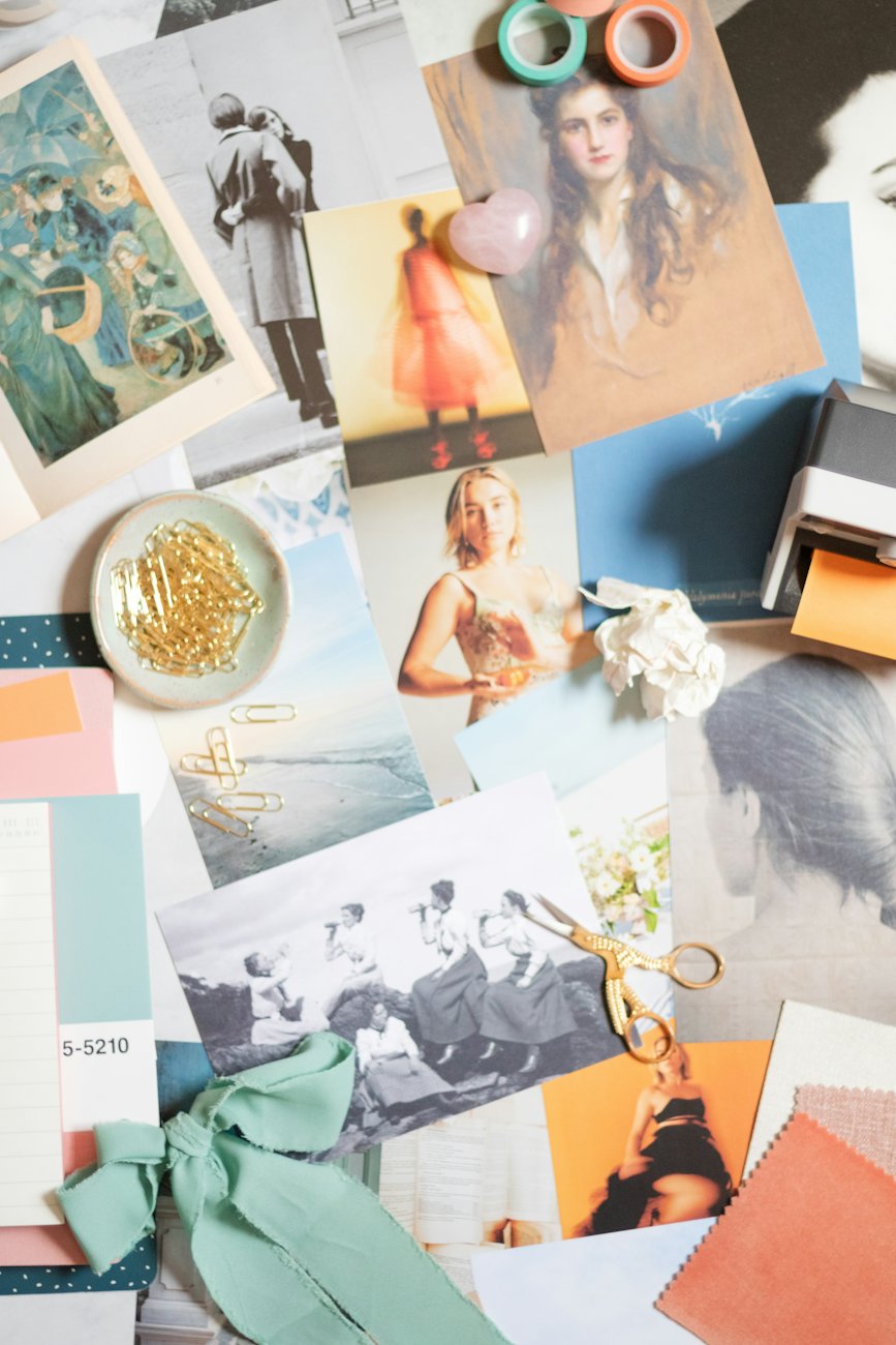 Proofs for Margin Quarterly, issue 12.
Design the sequence
A website can be read in any order; a magazine is turned page by page. We edit photographs like a film, with wide shots, details and pauses, and we leave white space where a reader needs to rest.
Check at the press
Screens lie about colour. For important runs we stand next to the press, compare sheets in daylight and adjust ink before thousands of copies are printed. It is the least glamorous hour of a project, and one of the most important.