Redesign of an independent magazine about architecture, objects and slow living.
Client Margin Publishing
Scope Editorial design, typography
Timeline 4 months
Year 2025
The challenge
After eleven issues, Margin had outgrown its template. Features were squeezed into the same three layouts, photographs were cropped to fit rather than to tell a story, and the production team rebuilt every issue from scratch.
Our approach
We designed a twelve-column grid with generous margins — the magazine’s name, taken literally. A serif for long reading, a narrow grotesque for captions and a picture-editing workflow that treats every feature as a sequence. Master layouts and paragraph styles now let the team build an issue in half the time.
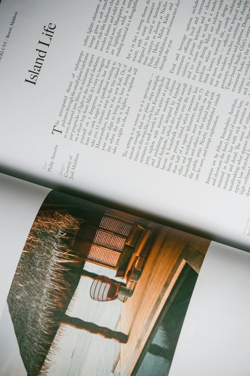 Objects section opener.
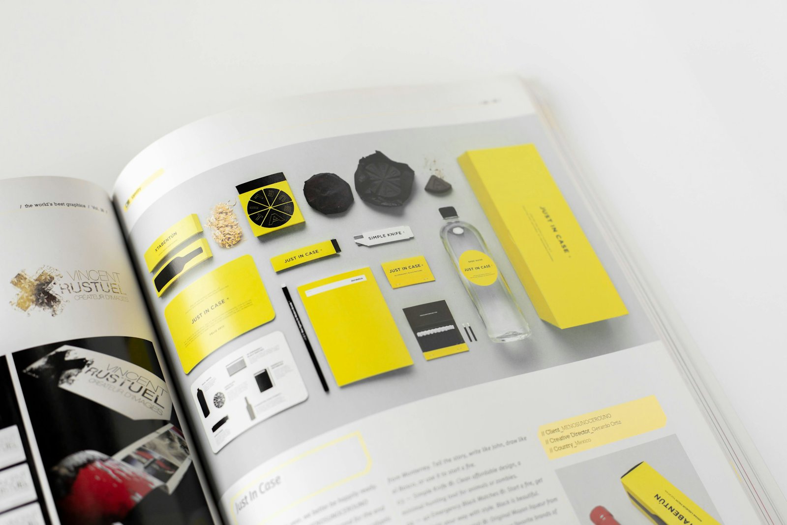 The index pages.
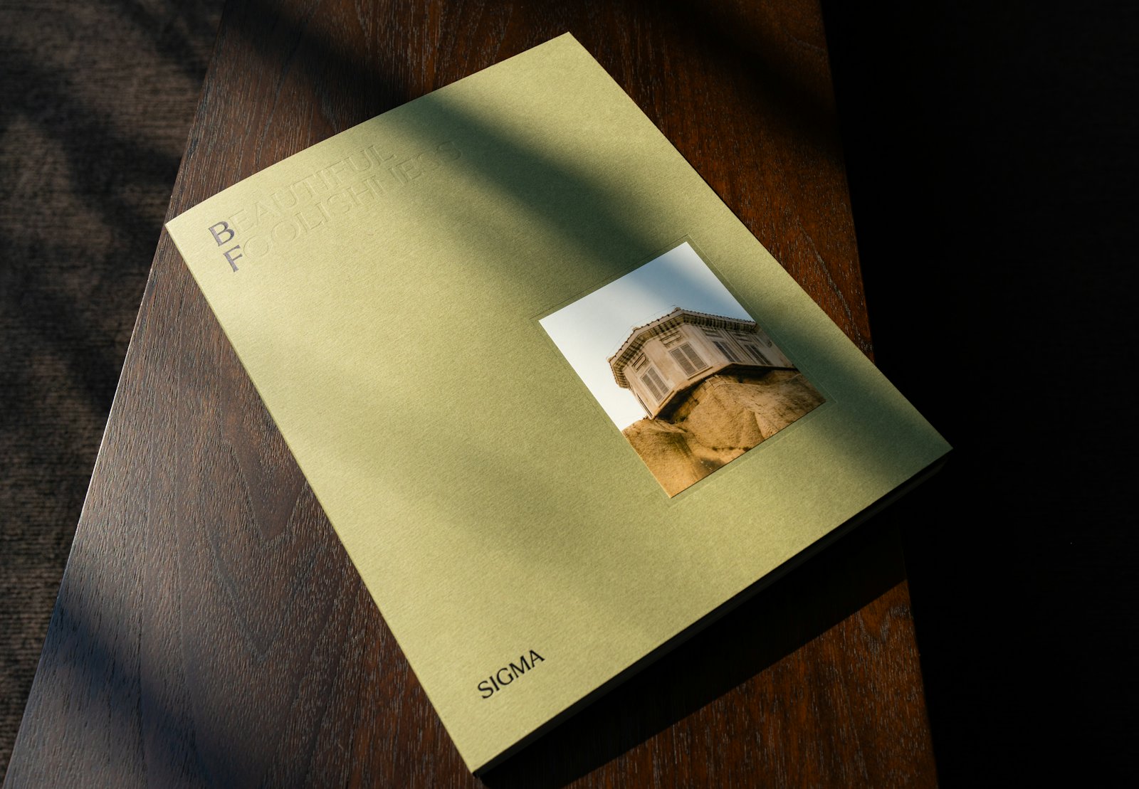 Issue 12, uncoated cover.
The result
Issue 12 sold out its print run of 3,000 copies and won Best Small Magazine at the Independent Publishing Fair. Subscriptions grew by a third in the following year.
3,000 copies sold out
+33% subscriptions in a year
50% less layout time per issue
The grid gave our writers room to breathe. Readers noticed before we told them.