Identity, packaging and photography for a neighbourhood bakery opening its second café.
Client Saffron & Salt Bakery
Scope Identity, packaging, photography
Timeline 6 weeks
Year 2025
The challenge
Saffron & Salt started as a single counter selling sourdough and saffron buns. Eight years later, with a second café on the way, the bakery had three versions of its logo, packaging that changed with every supplier and a menu typed in whatever font was open. Customers loved the bread but could not recognise the bag.
Our approach
We spent two early mornings behind the counter before we drew anything. The identity grew from what we saw: flour on dark aprons, saffron in glass jars, paper bags folded by hand. A hand-drawn wordmark, a palette of saffron, flour and crust, and one-colour printing on kraft paper keep the system warm and affordable.
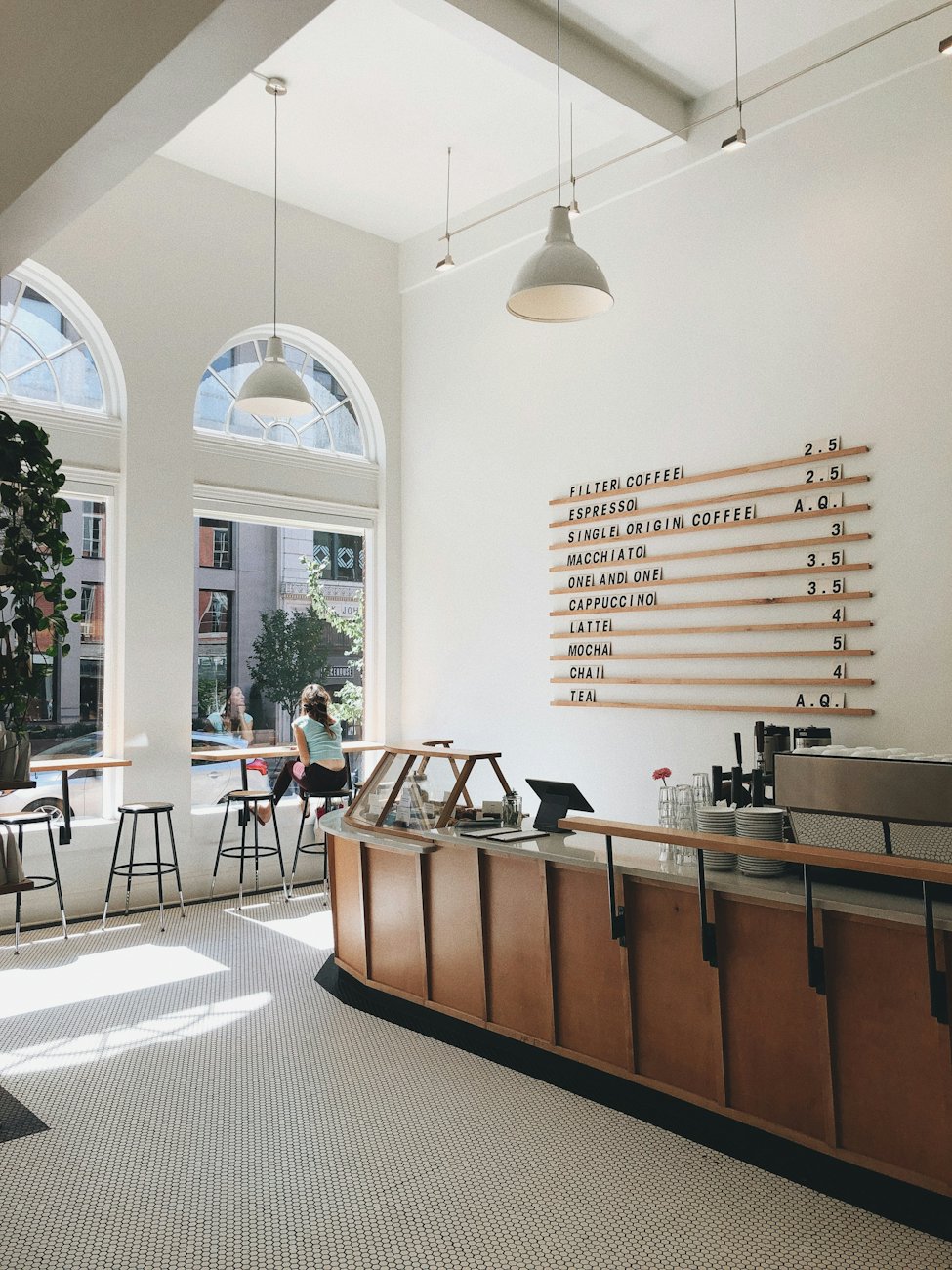 The new café counter.
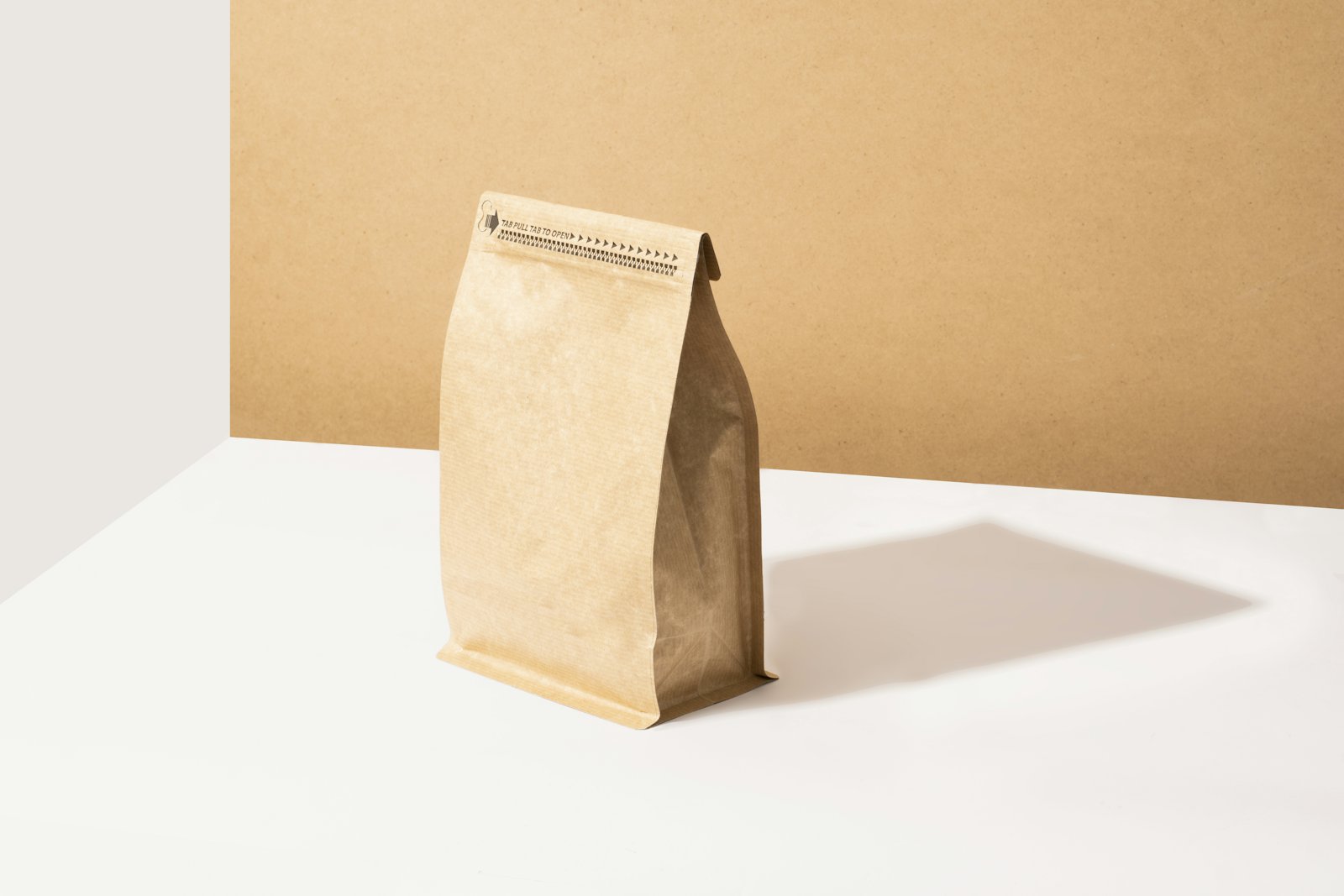 One-colour kraft bags.
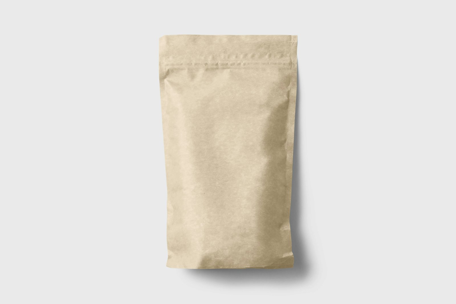 Granola pouch, printed in one colour.
The result
Both cafés now share one system, from the window lettering to the loyalty card. Moving to one-colour printing cut packaging costs by almost a third, and the bags have become the thing people photograph on the way out.
+38% weekend sales at the new café
−30% packaging cost per order
6 wks from brief to opening day
They understood the bakery before they understood the brief. The new bags feel like our bread.